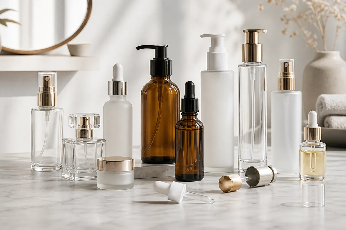
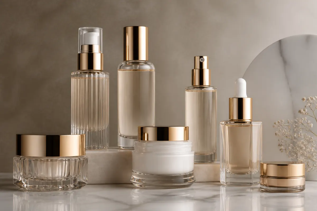
Luxury Cosmetic Packaging Design is not a checklist of heavy glass, metallic parts and expensive decoration. A luxury result is created when glass geometry, closure proportion, surface finish, graphics, dispensing function and secondary packaging feel intentional as one system—and when that system can still be sampled, approved and reproduced.
For B2B buyers, the practical objective is to separate visible luxury cues from unnecessary complexity. The bottle, closure, decoration, artwork and carton should each have a clear role. Exact compatibility, dimensions, color standards, formula performance, tooling and commercial terms remain project-specific and should be confirmed against the selected components, drawings and physical samples before bulk production.
| Design Decision | Luxury Value | Main Risk | What Buyers Should Verify |
|---|---|---|---|
| Glass and proportion | Creates silhouette, depth and tactile presence | Using unnecessary weight as a substitute for design | Actual bottle scale, base, filled appearance and handling |
| Caps and collars | Completes the bottle silhouette and touchpoint | Visual fit approved before technical compatibility | Exact bottle, closure and dispensing assembly |
| Surface finish | Controls transparency, color and visual texture | Digital mock-up differs from the physical substrate | Representative coated, frosted or clear sample |
| Metallic decoration | Creates a controlled focal point | Conflicting metallic tones or inconsistent component appearance | Final components and decorated sample viewed together |
| Custom geometry | Can create proprietary brand recognition | Tooling begins before key interfaces are resolved | Drawings, bottle/closure interfaces and physical samples |
Glass Clarity and Surface Quality
Luxury positioning starts with a defined material and surface direction, not a promise that every bottle will look “perfect.” Clear glass, colored glass, frosting and coating create different reflections, transparency and visual depth. Buyers should compare representative physical samples under consistent lighting and decide what appearance is acceptable for the selected bottle and finish.
A usable approval standard needs an identifiable bottle reference, selected finish, artwork revision and physical sample. Avoid creating unsupported universal limits for bubbles, surface marks, coating appearance or color variation when the exact product specification has not been established. Those acceptance criteria should be agreed for the actual packaging configuration.
Manufacturer Insight
FOLOVER recommends approving glass appearance and decoration as a system. A clear bottle that looks acceptable before filling may present differently once the formula, pump, collar and carton are added. Evaluate the representative assembled pack rather than approving the glass bottle in isolation.
Proportion Before Decoration
Bottle silhouette, shoulder transition, base and closure relationship create the visual structure before any printing or metallic decoration is added. A well-balanced stock bottle can look more considered than an elaborate custom design whose cap, body and base proportions do not work together.
Review several options at actual scale and with the intended closure attached. Renderings are useful for design exploration, but they can hide awkward assembled height, oversized caps or poor balance in the hand. Buyers should freeze the main bottle-and-closure proportion before final artwork and carton development.
Use a Heavy Base With Purpose
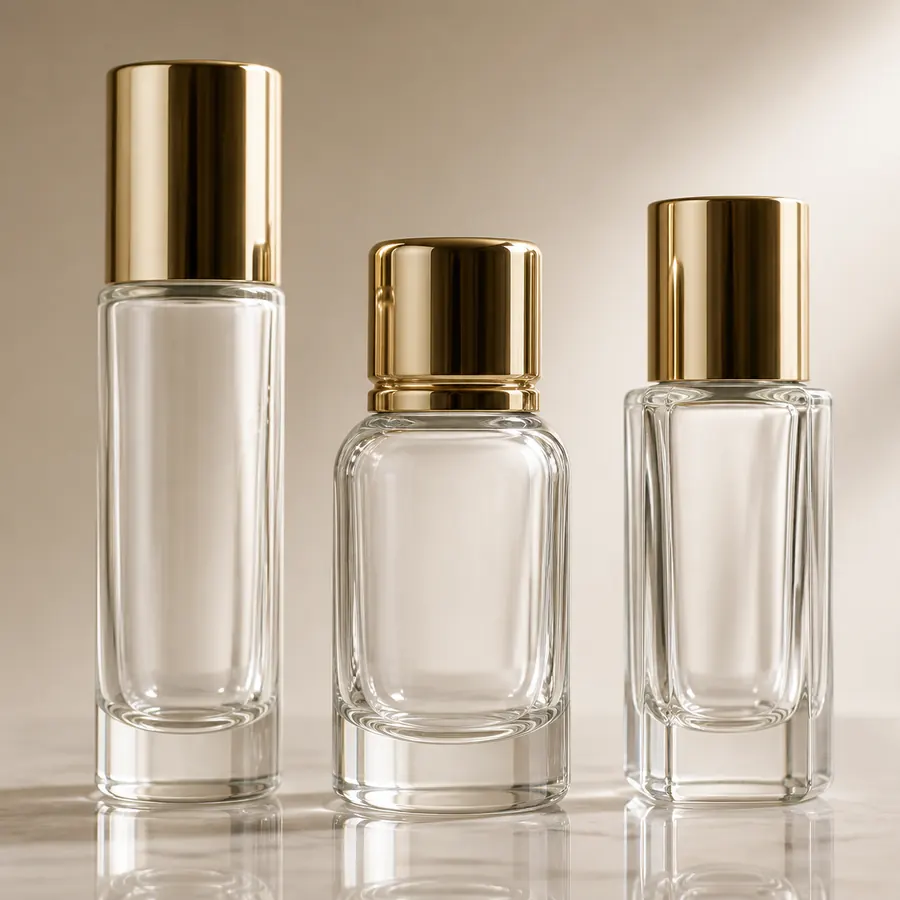
A substantial glass base can create visual depth and tactile presence, but heavier glass is not automatically more luxurious. Bottle geometry, capacity, filled weight, closure weight, handling, carton design and transport requirements all influence the finished experience.
For products intended for the EU market, weight also deserves a forward-looking regulatory review. Regulation (EU) 2025/40 on packaging and packaging waste, Article 10, requires by 1 January 2030 that packaging weight and volume be reduced to the minimum necessary to ensure functionality and specifically addresses features intended only to increase perceived product volume, subject to the Regulation’s stated exceptions. Buyers should therefore avoid treating unnecessary glass mass, false bottoms or extra layers as automatic luxury signals.
Key takeaway: Use weight when it supports proportion, stability, handling or a deliberate brand experience. Do not use extra material as the only evidence of premium positioning.
Design Caps and Collars Together
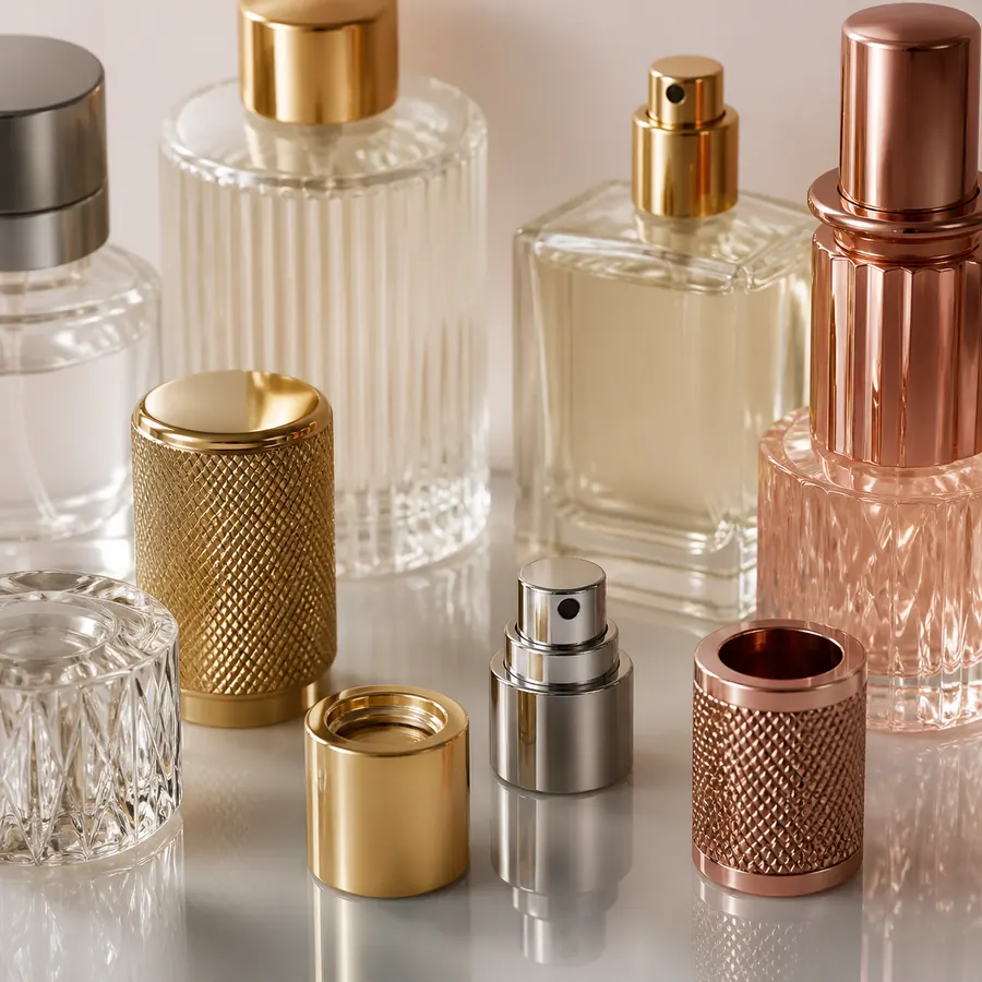
The cap, collar, actuator and bottle neck create one of the most visible transitions in luxury cosmetic packaging. Diameter, height, finish and material should be reviewed as one assembly rather than selected independently from catalog images.
Visual coordination does not prove technical compatibility. Depending on the system, compatibility may involve neck finish, thread or crimp structure, sealing geometry, gasket, closure construction, dip tube or pipette, bottle dimensions, formula characteristics and dispensing requirements. Final bottle and closure compatibility should be confirmed using the selected components and physical samples before bulk production.
Manufacturer Insight
A late closure change can alter assembled height, visible gaps, logo balance and carton dimensions even when the bottle itself does not change. Freeze the critical bottle-and-closure combination before final decoration placement and secondary-packaging approval.
Control Metallic Details
Hot stamping, metallized collars, metal-look caps and bright components can create a strong focal point, but more metallic elements do not automatically produce a more luxurious pack. Different substrates and finishing methods may reproduce “gold,” “silver” or other metallic effects differently.
If several metallic components must appear coordinated, review them physically together. Specify the intended reference and placement, then approve the assembled package instead of judging a foil swatch, collar or cap separately. Buyers considering metallic decoration can review hot stamping cosmetic packaging before defining the final process.
Compare Frosted, Coated and Clear Effects
Clear, frosted and coated glass create different visual relationships with the formula, artwork and closure. Clear glass emphasizes the contents and internal components; frosting reduces transparency and changes light diffusion; coating can introduce controlled color or opacity. None is automatically the most luxurious option.
The correct choice depends on the intended brand direction, formula presentation, decoration process and complete packaging system. Evaluate the selected treatment on the actual bottle because screen renderings cannot fully predict transparency, reflection, surface texture or how printed details will appear over the final finish. More detail is available in the guide to frosted cosmetic glass bottles.
Use Embossing or Custom Molding Strategically
Embossing, debossing and custom bottle geometry can create recognition without relying entirely on printed graphics. They are most useful when the structural feature has a clear brand or functional purpose and when the commercial project can support the additional development sequence.
Custom geometry should be evaluated before artwork and carton decisions are frozen. Bottle profile, neck and closure interfaces, decoration areas and other critical dimensions can affect downstream components. Buyers considering proprietary geometry can review how custom glass bottle mold development works before committing to tooling.
Build Restraint Into Color and Typography
A limited color palette and clear type hierarchy can make luxury packaging feel more controlled. Small typography, fine line work and low-contrast printing should be evaluated at actual package size rather than only on enlarged digital artwork.
Luxury styling also cannot eliminate required labeling space. ISO 22715:2006, which ISO currently lists as a confirmed standard, addresses cosmetics packaging and labelling. In the United States, the FDA Cosmetics Labeling Guide states that ingredient declarations are generally at least 1/16 inch high, with a 1/32 inch provision when the available labeling surface is less than 12 square inches. Exact requirements depend on the product and destination market, so buyers should reserve compliance space before artwork approval.
Connect Carton and Unboxing
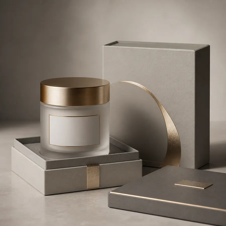
Secondary packaging should continue the same visual logic while protecting the decorated primary pack. Material, color, insert structure, opening sequence and graphics should support the bottle rather than compete with it.
Develop the carton around the final assembled bottle, not the bare glass dimensions alone. Check closure height, bottle orientation, movement inside the insert, ease of removal and contact between decorated surfaces and internal packaging. Elaborate inserts and multiple layers should have a functional or brand reason rather than being added simply to make the pack appear more expensive.
Design for Manufacturing Reality
Luxury details become controllable only when they are translated into identifiable production references. “Elegant gold,” “perfect alignment” or “premium matte finish” are useful creative directions, but they are not sufficient approval records.
The purchasing file should connect the selected bottle and closure references with final artwork, color or finish references, decorated samples and secondary-packaging configuration. Acceptance criteria that require exact tolerances or performance values should be agreed for the specific process rather than copied from unrelated projects.
Manufacturer Insight
Separate creative approval from production approval. First agree that the design direction is correct; then approve the actual component and decoration configuration that will represent bulk production. This reduces the risk of a visually approved rendering being mistaken for evidence that the physical package has been validated.
Test the Complete Experience
A luxury package should be evaluated through holding, opening, dispensing, closing and returning it to the carton. A bottle can look convincing when empty but behave differently once the closure and actual formula are involved.
Packaging compatibility should be evaluated with the actual formulation under intended storage and use conditions. Depending on the project, that evaluation may include dispensing behavior, leakage risk, component interaction, filled appearance and secondary-packaging fit. Do not treat one sample result as proof for a different bottle, closure or formula configuration.
Complete-Pack Evaluation
- Actual bottle proportion and standing stability
- Selected bottle-and-closure assembly
- Dispensing function with the intended component configuration
- Surface finish, color and decoration appearance
- Logo position and small-text readability
- Filled appearance when the formula affects transparency or color
- Carton and insert fit around the final assembly
Create a Controlled Approval Record
Luxury consistency is easier to maintain when every important decision has a reference. Keep approved component references, drawings, artwork revisions, color or finish samples and physical approval samples connected to the project rather than relying on photographs or informal descriptions.
If a bottle, closure, decoration process, formula or carton changes, identify which approvals need to be repeated. “Same as the previous order” is not enough when the physical configuration has changed.
Connect Design Choices to Related Packaging Decisions
Design quality improves when teams connect the main topic with adjacent technical and commercial decisions. Review premium cosmetic packaging without overcomplication, custom perfume bottle design, why heavy glass packaging is being reconsidered, and premiumization versus lightweighting. These related guides address different parts of the same system and are planning resources rather than substitutes for project-specific drawings, samples or tests.
For wider planning, use the luxury perfume packaging guide, perfume and cosmetic bottle caps, and custom packaging solutions. Suitable product formats can be reviewed through luxury perfume bottles. These pages support selection and development, but the exact bottle, closure and decoration combination still requires verification.
What Buyers Should Put in the Design Brief
- Target customer, market, sales channel and intended positioning
- Product type, formula considerations and dispensing preference
- Required capacities, bottle family and future SKU plan
- Selected stock bottle or reason custom geometry is required
- Exact closure, pump, sprayer or dropper interface to validate
- Color references and surface-finish priorities
- Decoration processes and final artwork priorities
- Destination-market labeling space
- Carton, insert, packing and photography requirements
- Sample stages, approval owners and retained approval references
- Commercial quantities, MOQ and timing confirmed separately for the exact configuration
Use Samples as Decision Evidence
Physical samples reveal scale, weight, reflection, color, tactile feel, fit and assembly behavior that a rendering cannot fully establish. A useful sequence may begin with available bottle and closure samples, move to color or decoration approval and finish with a representative complete assembly. The exact sequence depends on whether the project uses stock components, custom decoration or new tooling.
Keep the approved sample, drawing, component list and artwork revision connected. If a bottle, closure, finish, formula or secondary package changes, determine which earlier approvals need to be repeated rather than assuming the previous sample still represents the revised pack.
FOLOVER Packaging Resources
FOLOVER organizes design and sourcing guidance under Packaging Design & Branding and Packaging Trends & Insights. Buyers can use these resources to narrow the design direction, prepare supplier-ready information and identify interfaces that require physical validation. Availability, MOQ, lead time, tooling, compatibility and performance must be confirmed for the selected project rather than inferred from a general design article.
Related Blog Articles
Frequently Asked Questions
What makes cosmetic packaging look luxurious?
Luxury cosmetic packaging usually comes from coordinated proportion, material appearance, closure design, color, artwork and secondary packaging rather than one expensive feature. Buyers should evaluate the complete assembled pack and identify which elements create recognition before adding more weight, metallic finishes or decoration.
Does heavier glass automatically make cosmetic packaging more luxurious?
No. Additional glass can influence tactile feel and visual depth, but weight alone does not establish luxury or quality. Bottle geometry, handling, closure proportion, transport requirements and destination-market packaging requirements should be considered together before selecting a heavier design.
Should caps and collars be approved separately from the bottle?
No. Their visual appearance and technical fit should be evaluated with the selected bottle. Diameter, height, finish and color affect the assembled silhouette, while neck finish, sealing geometry and dispensing components can affect compatibility. Final approval should use the actual component combination.
Which is better for luxury packaging: clear, frosted or coated glass?
None is automatically better. Clear glass emphasizes the formula and internal components, while frosting or coating changes transparency, color and surface appearance. The appropriate option depends on the brand direction, formula presentation and decoration system, and should be approved on a physical sample.
When does custom molding make sense for luxury cosmetic packaging?
Custom molding is more justified when proprietary geometry contributes meaningful brand recognition or solves a structural requirement that suitable stock bottles cannot address. Buyers should confirm critical geometry and bottle-and-closure interfaces before tooling and before final decoration or carton decisions are frozen.
What should buyers approve before bulk production?
Buyers should confirm the selected bottle, closure combination, color or finish, decoration, artwork, assembled appearance and carton or insert configuration. Keep approved samples, drawings, component references and artwork revisions together so the bulk-production reference is clear and later changes can be traced.