
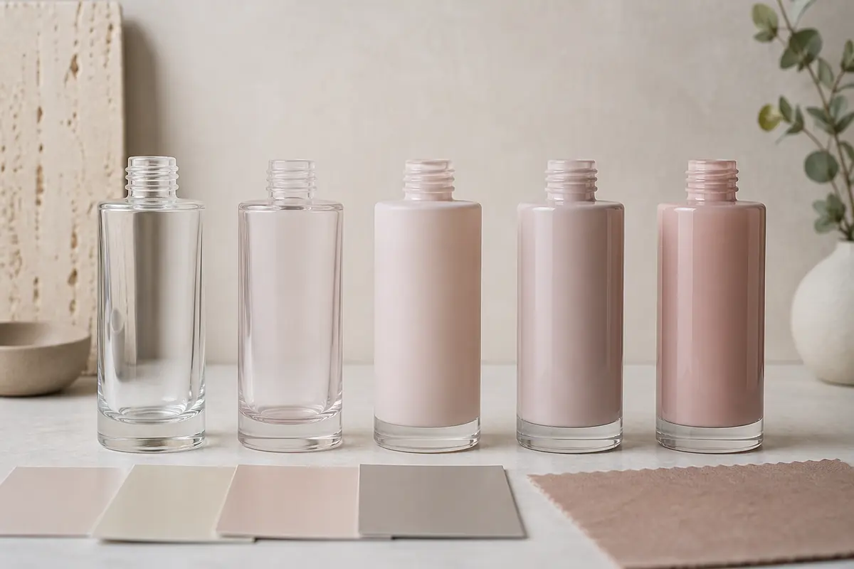
Cosmetic bottle color matching turns a digital color direction into a repeatable physical appearance on glass and packaging components. A Pantone reference can help communicate the target, but the final result also depends on the base glass, coating system, opacity, gloss, surface texture, bottle geometry, lighting and production process. Brands should therefore approve a clearly identified physical sample rather than treating a screen image, color code or paper swatch as the final production standard.
Why Screen Color Is Not a Production Standard
Phones, monitors and design software display color with emitted RGB light. Their brightness, calibration, viewing mode and surrounding light can make the same file look different. A glass bottle reflects and may transmit real light through a physical substrate, so it cannot be judged by the same mechanism.
Digital renderings remain useful for direction, layout and communication, but they should be labeled as visual references. Do not approve production from a screenshot, messaging-app image or uncalibrated display. Even a carefully prepared rendering cannot reproduce transparency, gloss, frosting, coating depth and reflections under every viewing condition.
What Pantone Can and Cannot Do
A Pantone reference gives the brand and supplier a shared starting point. It is especially useful when the team needs to distinguish between nearby color families or communicate a target across design, coating, printing and component suppliers. Record the exact Pantone reference and reference type so the team is not comparing different systems.
Pantone’s own Graphics System guidance distinguishes C and U references according to their appearance on coated and uncoated paper. The same nominal color can look different on those two paper surfaces because the substrate changes how the ink appears. For cosmetic glass packaging, this means a Pantone C or U reference should be treated as a communication target rather than a glass-specific production tolerance.
Clear, frosted or coated glass interacts with light, bottle thickness, background and surface finish. Plastic caps, metallic components and paper cartons may also render the same nominal reference differently. The goal is therefore a controlled visual relationship between components, not an unsupported promise that every substrate will look identical.
Key takeaway: use the color code to define the target direction, then use the approved physical bottle sample to define the production appearance.
Glass Color vs Spray-Coated Color
Colored glass gets its appearance from the glass material or manufacturing route, while spray coating applies a decorative layer to the bottle surface. The two options can create different depth, transparency, edge behavior and visual appearance even when they are described with similar color words.
Coating offers broad visual flexibility and may support opaque, translucent, gradient, matte or gloss directions depending on the confirmed process. Colored glass can provide inherent material color, but available hues and exact performance must be verified for the selected bottle. The overview of clear, amber and colored cosmetic glass explains why appearance and any protective requirement should be evaluated separately.
Transparent, Translucent and Opaque Finishes
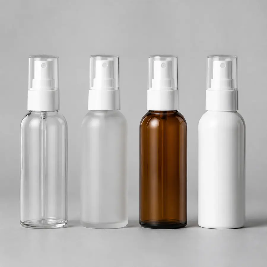
A transparent finish allows the bottle, product or background to remain visible. A translucent finish diffuses or partially transmits light, while an opaque finish hides most of the underlying glass. These are not only aesthetic labels: they change perceived color strength, depth and consistency across thick and thin areas of a bottle.
Define the intended opacity during sample development. A pale translucent coating may look stronger where glass overlaps visually, while an opaque coating can mask substrate differences that remain visible through a transparent finish. Buyers should therefore approve color and opacity as one specification rather than approving the color first and changing transparency later.
Matte vs Gloss Appearance
Matte and gloss versions of the same color can look different because surface reflection changes perceived saturation, contrast and highlight. Gloss surfaces usually show stronger specular reflections and may appear visually deeper, while matte surfaces scatter more light and can look softer or lighter. Neither finish is universally more premium.
The finish also affects how printing, hot stamping, caps and cartons relate visually. Approve the color and finish together. Changing from gloss to matte after color approval creates a new visual condition and should trigger another physical review rather than assuming the original color approval still applies.
How Base Glass Affects Final Color
Clear glass, frosted glass and glass with an inherent tint create different starting points. Bottle wall distribution, base thickness, curves and molded texture can also change visible color because light passes through or reflects from different amounts and angles of glass. Two bottle shapes using the same target coating may therefore not appear perfectly identical.
For a product family, compare all intended bottle and jar structures together. If cross-SKU harmony matters, the approval record should identify each substrate and finish separately. Do not transfer an approved sample from one model to another without reviewing the second model physically.
Why Physical Samples Matter
A physical sample reveals relationships that a color code cannot: transparency, gloss, edge coverage, base-glass influence, surface texture, cap contrast and behavior under different light. It also allows the team to assess how printing or metallic accents sit on the final coating.
Physical approval should happen on a sample representative of the proposed bottle structure and decoration process. A flat color chip can support communication, but it does not replace a decorated bottle. The dedicated guide to cosmetic packaging sample approval explains how references, revisions and approval responsibility should be controlled before mass production.
How to Review a Color Sample
- Confirm the exact bottle model, base glass and sample revision.
- Compare the sample with the agreed Pantone or other controlled color reference.
- Review transparency or opacity together with the color.
- Review matte, gloss or other surface finish as part of the same approval.
- Check the bottle under a defined lighting condition rather than moving between uncontrolled room lights.
- Review caps, pumps, droppers, collars, printing and cartons beside the bottle.
- Check the assembled package, not only loose components.
- Preserve one clearly identified approved physical reference for later production comparison.

How to Approve a Production Color Sample
Record more than a color code. The approval should identify the bottle, base glass, coating or glass-color route, transparency level, finish, artwork, component colors, reference lighting and the exact approved sample. Photographs are useful for traceability, but they should not silently replace the physical reference when the agreed approval method is based on a retained sample.
Set decision ownership before samples arrive. If marketing, design, packaging and procurement review independently and issue conflicting instructions, repeated adjustment rounds are likely. Consolidate comments, distinguish required corrections from preferences and release one authorized decision linked to the correct sample revision.
How L*a*b* and Delta E Can Be Used
For projects that require numerical color control, color can be expressed in the CIELAB system using L* for lightness, a* for the red-green axis and b* for the yellow-blue axis. A spectrophotometer can generate numerical color data, and a color-difference formula can then compare the approved reference with a production sample.
Delta E is a difference value, not a universal cosmetic-glass pass/fail limit. The CIE standardized the CIEDE2000 color-difference formula as ISO/CIE 11664-6:2022. It improves the relationship between numerical difference and perceived changes in lightness, chroma and hue, but the standard does not prescribe one universal acceptance threshold for cosmetic bottle coatings.
For that reason, this guide does not apply an unsupported rule such as “all cosmetic bottles must be below ΔE 1.5.” If measured tolerances are required, the buyer and manufacturer should agree the color-difference formula, measuring method, instrument setup, relevant surface or measurement area and acceptance limit for the exact bottle and finish.
| Color Control Reference | What It Helps Define | Main Limitation | What Buyers Should Confirm |
|---|---|---|---|
| Pantone reference | Shared target color direction | C and U references describe appearance on coated or uncoated paper, not glass production | Exact code, reference type, bottle substrate and physical sample |
| CIELAB L*, a*, b* | Numerical description of color coordinates | Numbers alone do not define gloss, opacity, texture or complete bottle appearance | Measurement method, sample area and finish condition |
| CIEDE2000 ΔE00 | Numerical comparison between two colors | No universal cosmetic-glass acceptance threshold | Project-specific formula, method and agreed tolerance |
| Defined viewing condition | More consistent visual comparison | One light source may not represent every retail or use environment | Which lighting condition governs approval and which additional environments should be reviewed |
| Approved physical bottle | Actual appearance of substrate, coating, opacity, finish and geometry together | Reference samples must be clearly identified, protected and retained | Sample revision, approval owner and production-comparison method |
Technical reference: ISO/CIE 11664-6:2022 defines the CIEDE2000 colour-difference formula. ISO 3664:2025 defines controlled viewing conditions for critical color evaluation in graphic technology and photography. These standards support disciplined color communication, but neither establishes a universal pass/fail tolerance for cosmetic glass bottles.
Manufacturer Insight
Color approval should be tied to the complete production configuration, not only to a Pantone number. FOLOVER recommends identifying the bottle model, base glass, coating route, opacity, finish, printing, closure or dispensing components and sample revision before bulk decoration is released.
If the buyer changes the bottle model, coating transparency, matte or gloss level, decoration sequence or component color after approval, the appearance should be reviewed again on physical samples. A color that was approved on one structure should not automatically be transferred to another SKU or finish.
Batch-to-Batch Variation
Physical production can show variation between coating batches, glass batches, component materials and process conditions. “Zero variation” is not a credible general promise. The project should define how representative production units will be compared with the approved reference and whether acceptance is visual, instrument-based or a combination of both.
If numerical measurement is part of the specification, preserve the measurement conditions as well as the target value. Different instrument geometry, measurement areas, gloss conditions or sample backgrounds can change results, particularly when the package is curved, glossy, translucent or metallic.
Review representative units rather than one ideal bottle. Compare the bottle body, shoulder, base and any visually difficult areas, then inspect the assembled pack. If production differs from the approved appearance, preserve both references and investigate the material, process, lighting and measurement conditions before assigning a cause.
Color Matching With Printing and Hot Stamping
Printing adds another ink or decoration layer, while hot stamping introduces a foil or metallic surface. Both can change how the bottle color is perceived. Low contrast can reduce logo legibility, while a bright metallic accent can make a muted coating appear darker by comparison.
Approve the complete decoration stack in the correct sequence. The article on screen printing cosmetic glass bottles covers artwork, color and print-sample questions that a coating-only approval cannot resolve. Buyers can also review FOLOVER’s decoration and finishing options when coating, frosting, printing or hot stamping need to be coordinated in one project.
Common Color Approval Mistakes
- Approving a bottle from a phone or monitor image.
- Sending a color name without a controlled reference.
- Treating a Pantone C or U paper reference as a guaranteed glass result.
- Approving a flat chip but not the actual bottle surface.
- Changing opacity, coating route or gloss level after color approval.
- Comparing samples under different or strongly colored light.
- Applying one approved color sample to a different bottle geometry without review.
- Assuming glass, plastic, metal and paper will match identically.
- Specifying a numerical Delta E requirement without defining the formula and measurement method.
- Failing to retain an identified approved physical sample.
Color is only one part of customization. The broader guide to cosmetic glass bottle decoration methods helps buyers decide when coating, frosting, printing, hot stamping or labels fit the design.
Plan Color Within the Complete Packaging System
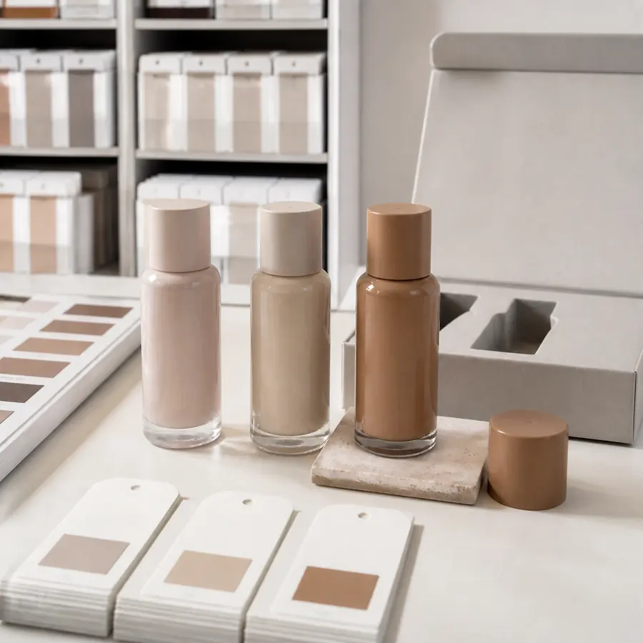
The bottle should be reviewed with its pump, dropper, cap, collar, label and carton. Different materials reflect light differently, and an assembled package may expose contrasts that are not obvious when components are reviewed separately. The target should therefore be visual coordination across the complete package, not an unsupported promise that different substrates will produce identical color values or identical appearance.
Buyers can explore cosmetic and skincare glass packaging before developing the color direction for the selected structure. Use the skincare packaging guide to connect appearance with the product and dispensing system, and custom packaging solutions when bottles, closures, decoration and secondary packaging require coordinated development.
Related production guidance is grouped under Customization & Manufacturing, while broader visual strategy topics appear under Packaging Design & Branding.
Conclusion
Frequently Asked Questions
Can cosmetic bottles match a Pantone color?
A Pantone reference can define the target direction, but it does not guarantee an identical result on glass. Base glass, coating, opacity, gloss, geometry and lighting all influence the physical appearance. Buyers should record the exact Pantone reference and then approve the final appearance on a representative decorated bottle before bulk production.
Why does a bottle look different from a Pantone card?
Pantone Graphics references are printed on controlled paper substrates, while a cosmetic bottle may be clear, frosted, coated, curved or partially transparent. Pantone also distinguishes C and U references according to coated and uncoated paper. A bottle therefore needs its own physical approval rather than being judged only against the paper swatch.
Is spray coating the same as colored glass?
No. Spray coating applies a decorative layer to the bottle surface, while colored glass derives its appearance from the glass material or manufacturing route. They can differ in depth, transparency, edge appearance and visual consistency. Buyers should evaluate the selected route on the actual bottle instead of assuming similar color names will create the same result.
Should I approve a physical color sample?
Yes. The sample should represent the selected bottle model, base glass, coating route, opacity, finish and relevant decoration. Closures and other visible components should also be reviewed with the bottle. Keep one clearly identified approved reference so representative production units can later be compared with the correct sample revision.
Can matte and gloss versions of the same color look different?
Yes. Surface reflection changes perceived saturation, contrast and depth, so matte and gloss versions of the same target can look different even when their basic color direction is similar. If the finish changes after color approval, treat it as a new appearance decision and approve another physical sample rather than carrying the original approval forward automatically.
Can bottle color vary between production batches?
Some physical variation can occur because glass, coatings, components and process conditions are not perfectly identical from batch to batch. The project should define how representative production units will be compared with the approved sample. If numerical color measurement is required, the formula, instrument method and acceptance tolerance should be agreed for the exact packaging configuration instead of applying a universal Delta E limit.