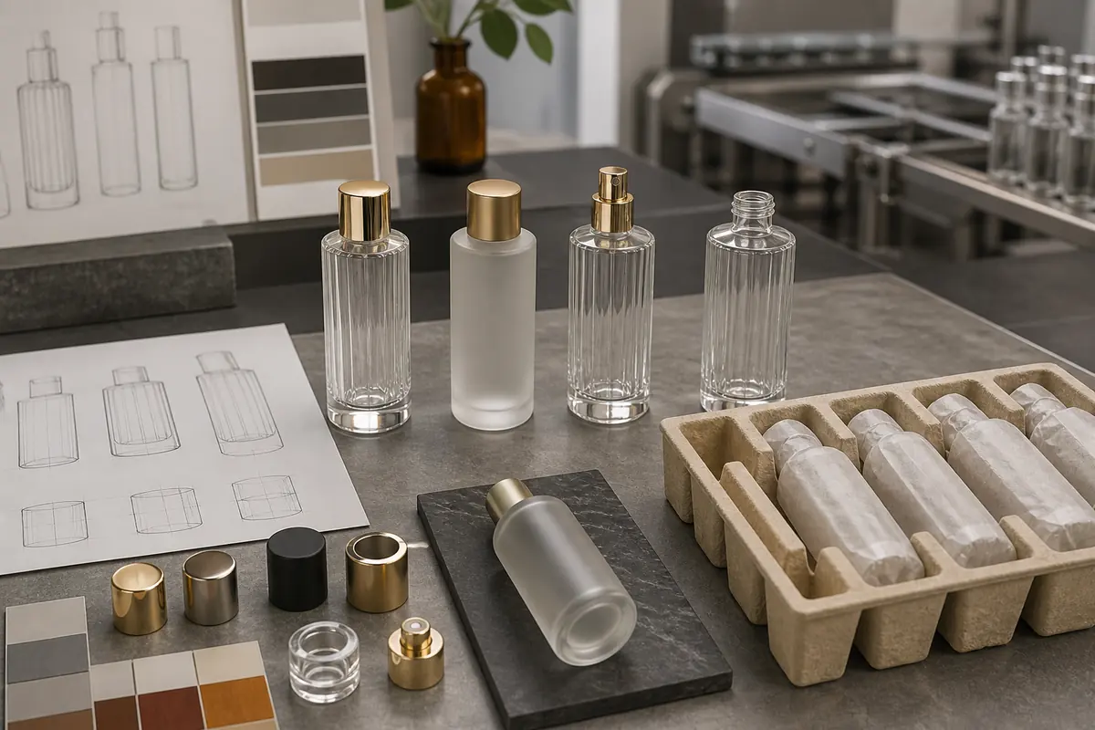
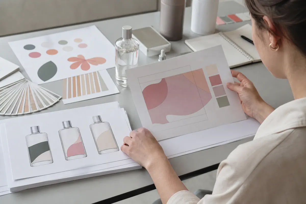
Cosmetic packaging artwork preparation turns a brand design into production-ready files for a specific bottle, decoration area, and manufacturing process. A logo that looks correct on a screen may print too close to a curved edge, lose fine details, or appear off-center once the cap is installed.
Before sending artwork for production, confirm the exact bottle drawing, printable area, file format, color references, decoration method, and artwork revision. The decoration supplier should verify production feasibility for the selected glass bottle rather than relying on generic printing dimensions or design specifications.
Start With the Correct Bottle Drawing
Artwork should begin after the exact bottle or component is selected. Similar bottles can differ in shoulder shape, panel width, taper, seam position, and printable area. A design placed on the wrong outline may appear centered on screen but shift or distort on the finished package.
Request the current bottle drawing and decoration template from the packaging supplier. Record the bottle model, capacity, and drawing revision in the artwork file so the design team and production team work from the same reference.
Manufacturer Insight: When a brand uses the same artwork across several bottle capacities, each bottle should be checked separately. A logo approved on a straight-sided serum bottle cannot automatically be transferred to a tapered bottle or cream jar using the same scaling percentage. Confirm the decoration area for each format before preparing production files or ordering decoration samples.
Define the Decoration Area
The decoration area identifies where printing, foil, or labels can be applied reliably. It may exclude shoulders, bases, sharp corners, recessed zones, seams, or areas with strong curvature. The available area depends on the bottle geometry and the selected decoration equipment.
Keep essential logos, product names, and required packaging information within the confirmed decoration area. Also consider the assembled package: a pump, collar, or cap can change the visual center or partially conceal artwork.
For curved or tapered bottles, request a supplier-confirmed decoration template instead of calculating the printable area from the overall bottle dimensions.

Vector Versus Raster Artwork
Vector graphics use scalable paths and are commonly preferred for logos, line art, solid-color printing, and hot-stamping artwork. Raster images consist of pixels and may be suitable for photographic content or certain label-printing processes, provided the resolution meets the production requirements.
For a screen-printed logo or hot-stamped design, an editable vector file is generally more useful than a flattened image. However, a vector file does not guarantee that every line, font, or graphic detail can be reproduced on glass.
Confirm the supplier’s accepted file format before handoff. Preserve editable source files, resolve missing linked graphics, and convert text to outlines when required while retaining an editable master copy.
Adobe’s Illustrator file packaging guidance explains how to collect linked graphics, fonts, and supporting files for a controlled handoff. The final production package should still follow the decoration supplier’s specific requirements.
Specify Colors and Processes
Every design element should have a defined production method. A gold-colored logo in a digital mockup does not tell the supplier whether the intended finish is metallic ink, hot stamping, or another approved decoration process.
Identify the required coating, printing, foil, and label elements separately. Provide agreed color references, such as the applicable Pantone reference, where appropriate.
A color reference communicates the intended appearance but does not guarantee an identical result on every glass substrate or decoration process. Transparent glass, colored coatings, surface gloss, and underlying materials can influence the finished appearance.
The cosmetic bottle color matching guide explains these considerations in more detail. For production approval, compare the decorated physical sample with the agreed color reference under suitable viewing conditions.
Line Weight, Small Text and Fine Detail
Review artwork at its actual production size. Thin strokes, small lettering, narrow gaps, and complex patterns may appear clear on an enlarged monitor but fail to reproduce consistently during printing or stamping.
For example, a small logo containing closely spaced letters may lose definition when transferred to a curved bottle. Increasing the font size, simplifying the graphic, or adjusting letter spacing may produce a more reliable result than retaining every detail of the original digital design.
There is no universal minimum line width or text size suitable for every cosmetic glass bottle. The practical limit depends on the selected process, bottle geometry, tooling, ink or foil, and production equipment.
Where fine detail is important to the brand identity, request a feasibility review and approve a physical decoration sample before bulk production.
Curves, Taper and Visual Distortion
Artwork on a curved bottle is viewed through perspective and may wrap away from the front. Taper can also change how horizontal lines, circles, and lettering appear.
A graphic that is mathematically centered on a flat template may not look centered on the finished bottle. This becomes more noticeable when the design includes long horizontal text, circular logos, or elements positioned near the edges of the decoration area.
Confirm the intended front orientation and review the artwork on an assembled physical sample. If the bottle has a defined front panel or asymmetric shape, the printing position should be established before preparing the final production file.
Prepare Files for Screen Printing
Screen-printing artwork should identify each printable color and the relationship between color layers. Multi-color designs require particular attention to registration, overlapping elements, and the intended printing sequence.
For a logo with two printed colors, the supplier needs to distinguish which elements belong to each color rather than interpret the design from a flattened visual file.
Adobe’s color separation guidance explains the preparation and preview of individual print colors. Its general prepress principles can support artwork preparation, although cylindrical glass screen printing requires process-specific review by the decoration supplier.
The guide to screen printing cosmetic glass bottles covers bottle shape, color sequence, and production considerations. Confirm the approved print order and underlying surface before releasing the artwork.
Prepare Files for Hot Stamping
Hot-stamping artwork defines the areas where metallic foil will be transferred. Thin lines, narrow gaps, large solid areas, and decoration near curved edges may present different production challenges.
Identify foil elements separately from printing and coating. A metallic-looking digital graphic should not be treated as an approved hot-stamping specification.
If a design combines a printed product name with a hot-stamped logo, confirm the intended position and visual relationship between the two processes. The supplier should review whether the selected bottle geometry and decoration sequence can reproduce the design consistently.
See the hot stamping cosmetic packaging guide for substrate, geometry, registration, and sample approval considerations.
Prepare Label Artwork
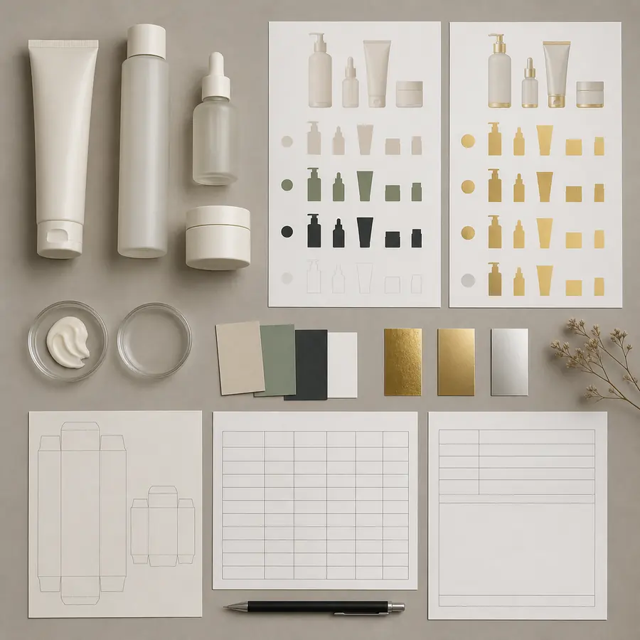
Label artwork requires the confirmed label dimensions, material, application area, bleed, safe-area guidance, and final product information.
Bottle curvature and taper affect label fit. A rectangular label designed for a straight-sided bottle may wrinkle, lift, or appear misaligned when applied to a tapered surface. Confirm the label shape and application requirements with the label and packaging suppliers.
The responsible brand or regulatory team should review product claims, ingredient information, mandatory symbols, and other market-specific labeling requirements. Production artwork approval does not replace the applicable regulatory review.
Coordinate Multiple Decoration Processes
When a bottle combines coating, screen printing, and hot stamping, the artwork package should identify each process and its relationship to the others.
For example, a logo printed over a colored coating must be evaluated on that actual coated surface. A foil element positioned beside printed text also requires the relative alignment to be approved on the finished bottle.
The decoration sequence can affect appearance, adhesion, and registration. Avoid changing the agreed process order after sample approval without checking the potential effect on the finished package.
The overview of cosmetic glass bottle decoration methods explains the available finishing options and their practical differences.
Use Version Control
Each production file should have a clear revision number and approval status. The purchase record should identify the approved artwork revision, bottle model, color references, and decoration process.
A filename such as “final-new-2” does not reliably identify the approved production version. Use a consistent naming convention and record the approval date and responsible approver.
If the logo, product information, bottle type, decoration position, or color changes after sample approval, issue a new artwork revision and determine whether another physical sample is required.
Review the Assembled Pack and Product Family
Artwork should be evaluated with the actual cap, pump, collar, or dropper installed. These components affect the visual center, available contrast, and apparent spacing.
A logo may look balanced on an isolated glass bottle but appear too low after a long dropper cap is installed. The same issue can occur when a brand changes from a short pump to a taller closure without reviewing the original decoration position.
For a multi-SKU collection, adapt the artwork to each confirmed decoration area while maintaining a consistent visual hierarchy. The logo does not necessarily need identical physical dimensions on every bottle; the assembled packages should be reviewed together for apparent size, position, and readability.
FOLOVER PACK Manufacturer Insight: For a coordinated skincare collection, approve the decorated bottles together with their selected closures before confirming the complete series. Bottle color, printed logo, collar finish, and cap color should be evaluated as one packaging system. Approving each component separately may overlook visual inconsistencies that become obvious when the finished products are displayed side by side.
Prepare an Approval Proof
Before physical sampling, prepare an approval proof identifying the bottle model, artwork revision, decoration position, color references, process layers, and intended front orientation.
The proof allows the brand and supplier to check the content and design placement before decoration begins. It does not establish whether the selected production process can reproduce the artwork consistently.
After decoration, compare the physical bottle with the approved proof and physical color references. Check logo position, text legibility, color appearance, registration, and the assembled package.
Physical Sample Approval
The approved production reference should consist of the final artwork revision and an accepted physical sample representing the selected bottle and decoration configuration.
Record any accepted visual deviation in writing. Do not release a revised production file after sample approval without reviewing whether the change affects decoration feasibility or requires another sample.
Common Artwork Problems That Delay Production
Most artwork handoff problems become more expensive to correct after decoration samples or production tooling have been prepared. The following issues should be resolved before production approval.
| Artwork Problem | Potential Production Risk | Buyer Action |
|---|---|---|
| Wrong bottle drawing or decoration area | Misaligned artwork, unsuitable placement, or designs extending beyond the printable surface. | Confirm the exact bottle model and supplier-approved decoration template. |
| Missing fonts, linked graphics, or editable paths | Unexpected font substitution, missing elements, or incorrect production files. | Supply the required source files and verify that the supplier can open them correctly. |
| Unidentified colors or decoration processes | Incorrect ink, foil, coating, or interpretation of the intended design. | Identify each process and color reference separately. |
| Fine details not evaluated at actual size | Loss of text legibility, incomplete printing, or poor foil transfer. | Request a feasibility review and approve critical details on a physical sample. |
| Conflicting artwork revisions | Production using outdated logos, product information, or decoration positions. | Confirm one approved revision and remove superseded files from the active handoff. |
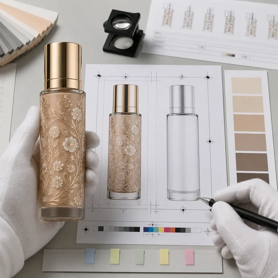
Artwork Handoff Checklist
- Confirm the exact bottle model, capacity, and current drawing revision.
- Obtain the verified decoration area and confirm the assembled-package orientation.
- Supply the requested production file format with the necessary editable artwork, fonts, and linked graphics.
- Identify each printed color, coating, foil, and label element.
- Review small text, fine lines, and critical graphic details at actual production size.
- Confirm the decoration sequence and required alignment between different processes.
- Identify the final artwork revision and responsible approver.
- Confirm that market-specific product information and claims have received the required review.
- Approve the decorated physical sample and retain the corresponding artwork revision before bulk production.
Coordinate Artwork With Packaging Development
Artwork preparation should follow bottle selection rather than proceed independently from packaging development.
Choose the structure from cosmetic and skincare glass packaging, then coordinate production files through decoration and finishing options. The skincare packaging guide supports the broader bottle and dispenser choice.
After a decorated sample is made, use the cosmetic packaging sample approval process to freeze the accepted revision. More production guidance appears under Customization & Manufacturing and Packaging Technology.
Conclusion
Production-ready cosmetic packaging artwork is more than a finished brand design. It must match the exact bottle, confirmed decoration area, selected manufacturing process, and approved component configuration.
For an existing bottle, use the supplier’s confirmed drawing and decoration template before preparing production files. For a new bottle design, finalize the relevant geometry and decoration requirements before approving the artwork for production. In either case, the physical decorated sample should serve as the final visual reference.
FOLOVER PACK supports cosmetic glass bottle selection, decoration planning, component coordination, and custom packaging development. Share your selected bottle, logo files, color references, and intended decoration methods to discuss artwork preparation and sample approval for your packaging project.
Frequently Asked Questions
Should cosmetic bottle artwork be vector?
Vector artwork is commonly suitable for logos, line art, printing and stamping, but the production supplier should confirm the required format.
Can a PDF mockup be used directly for production?
Not automatically. The file must match the correct bottle, decoration area, process, colors and supplier requirements.
How are print colors specified?
Use agreed references and identify each color layer, then approve the physical result on the final substrate.
Why does artwork distort on curved bottles?
Curvature and taper change apparent scale and perspective. Use the confirmed template and evaluate a physical mockup or sample.
When should artwork be reapproved?
Reapprove when the bottle, process, color, content, position or other production-relevant revision changes.
Who checks regulatory packaging text?
The responsible market and regulatory team should confirm required wording and claims; production artwork review does not replace legal review.