

Minimalist Cosmetic Packaging: How to Create a Clean, Modern Brand Look
A practical guide to minimalist cosmetic packaging that preserves identity, readability and manufacturing control.
A practical guide to minimalist cosmetic packaging that preserves identity, readability and manufacturing control.

Understand the material, proportion, closure and decoration decisions that make luxury cosmetic packaging coherent and manufacturable.

Premiumization and lightweighting are not opposite material targets; they are a design-allocation decision across the complete cosmetic packaging system.
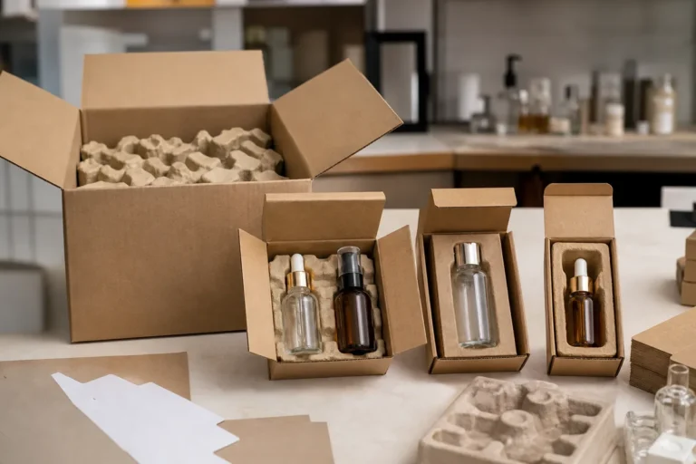
A practical framework for reducing cosmetic cartons, inserts and transport volume without increasing glass damage or product loss.
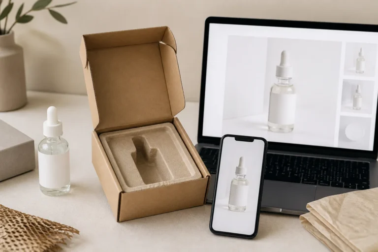
E-commerce requires cosmetic packaging to perform across thumbnails, product pages, parcel distribution, unboxing, and customer review images—not only on a shelf.

A cross-channel guide to cosmetic packaging that works in ecommerce imagery, retail display, physical handling and shipment.

A practical, non-prescriptive guide to color meaning, finish, context and sample approval in cosmetic packaging.

Learn how to organize bottle families, closures, colors and decoration into a coherent cosmetic packaging system for multiple SKUs.

An evidence-first framework for recyclable, refillable, recycled-content and source-reduction claims on cosmetic packaging.